Instead of taking a class, I'm going to teach myself PhotoShop, using my own images and document them here daily.
Showing posts with label learning photoshop. Show all posts
Wednesday, February 29, 2012
Monday, February 27, 2012
Monday, February 13, 2012
44. Haystack Rock
I haven't really gotten into using the curves for color and contrast correction, so I was happy when I found a simple way to make photos pop, by simply duplicating the layer and changing the blending mode to soft light.
Keep duplicating layers until the desired effect is achieved. If you want further tweaking, you can adjust the opacity from 100% to whatever you are comfortable with.
before:
Thursday, February 9, 2012
40. Many faces
Tonight, I played with an image by creating many different layers and using the puppet warp tool to peel away different parts of the face and then changing the scale of the warped images. The collage was fun, but discovering the 3D New Shape from Layer tool was even better. I used the cube and the ring here.
38. Marble
Using a photo from last year's project and this incredible one by Misha, compiling many of the 2011 365 projects , I resized it, and warped the image to fit onto the marble.
Wednesday, February 8, 2012
Tuesday, January 31, 2012
Monday, January 23, 2012
23. Filter Experiment
Here is the self portrait I took today for a Richmond Photography Meetup monthly challenge. I tried lots of different artistic filters. This is what they did:
![]() |
| Original |
![]() |
| Emboss at 90 degrees |
![]() |
| Diffused Glow |
![]() |
| Dark Strokes |
![]() |
| Plaster |
![]() |
| Patchwork |
Saturday, January 21, 2012
21. Changing Eye Color
This tutorial was much easier than I thought. So easy I should probably work on another image, or at least start on tomorrow's project, but I'm not.
Here, I turned my baby's brown eyes blue.
for a more natural blue I could have done two things:
1. chosen a less striking blue hue
2. adjusted the opacity (here it is at 58%)
but I wasn't going for natural;)
Thursday, January 19, 2012
18. Clone Stamp
Fascinated by the paranormal and often trying to create "spooky" in my images, either with crime scenes or mirrors, I was drawn to a tutorial that helps you create a ghost-like image.
I found that using the clone tool alone is an important lesson, so actually creating the ghost will be featured on day 19:)
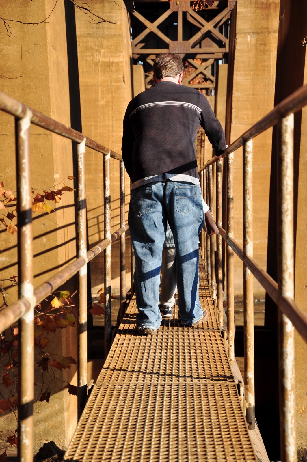
Here is the original of my husband and son walking the pipeline bridge in Richmond, VA.
Here is the image after removing the subjects and cloning the surrounding areas:
Monday, January 16, 2012
15. Canvas Texture Imitation
I used this tutorial to create a canvas texture. The first photo I used was black and white, and the effect wasn't as noticeable, so I got more practice and tried it again with this photo:
Sunday, January 15, 2012
14. Sharpening, Watercolor with Saturation Boost
I'm behind posting because I currently have three projects going, none of which I can completely get through. I keep getting hung up on certain steps. I will either revisit the projects later once I know more about Photoshop or muddle through, depending on my patience level.
For now I worked with a photo taken at Poe's 203rd birthday bash which I was happy with compositionally, but it was not quite sharp in focus, so I took the following liberties with it.
before:
after:
toned down:
Tuesday, January 10, 2012
10. Classic Solarisation Photo Effect in Photoshop
"Solarisation has been used since the very beginning of photography but was made famouse by Man Ray when he rediscovered the technique by accident in the 1930′s. The effect consists mainly of partially reversed tones in an image recorded on a negative or a photographic print. Basically the dark areas appear light or the light areas appear dark. The effect was usually caused by accidentally exposing an exposed plate or film to light during developing. That said, results were usually unpredictable and good results were obtained by luck and lots of practice. In this tutorial, I’m going to show you a simple way of getting similar results in Photoshop without having to lock yourself in the darkroom!"
-Photoshop Road Map
I tried a few photos out for this and none of them really "did" it for me. Here is the before picture of a paper mache skull I used before decorating it here:
here it is with solarisation:
Monday, January 9, 2012
9. Simple Orton Effect for Dreamy Soft Focus Images
"In this tutorial I’m going to show you how I generally apply a soft focus trick known as the Orton Effect after it’s creator photographer Michael Orton. In the film days, this effect was achieved by overlaying two or more images of an identical scene with different exposures and focus on slide film. To do this, you had to use a tripod so your images would align perfectly.

Nowadays, you can achieve the same results with just a single image using Photoshop. This technique will add a vintage dream like feel to your images very suitable for portraits, weddings, landscapes and children photography."
I used this image I took of a sunset in Fishing Bay, VA:

7. Turning an Image Black and White
I followed this tutorial about turning my image black and white.
"Back in the day, when one would print their own black and white prints, you had a choice of a zillion different papers. They basically boiled down to cooltone and warmtone papers. This combined with different developers gave one an array of tones to choose from for any given picture. Sadly, nowadays it’s getting harder to find specific papers and certain developers are no longer being manufactured. In the digital era, most people who might not have gone through the trouble of trying different tones of paper (or even B&W printing for that matter) will be satisfied with converting a color image to a straight B&W palette by simply desaturating the color. Today we’re going to take it a step further. Achieving different tones for specific images will help you create different moods according to the overall look you’re going for." -Photoshop Road Map
Subscribe to:
Posts (Atom)